How do 2D top-down games convey depth?
If you don’t know, classic Dwarf Fortress usually looks something like this:
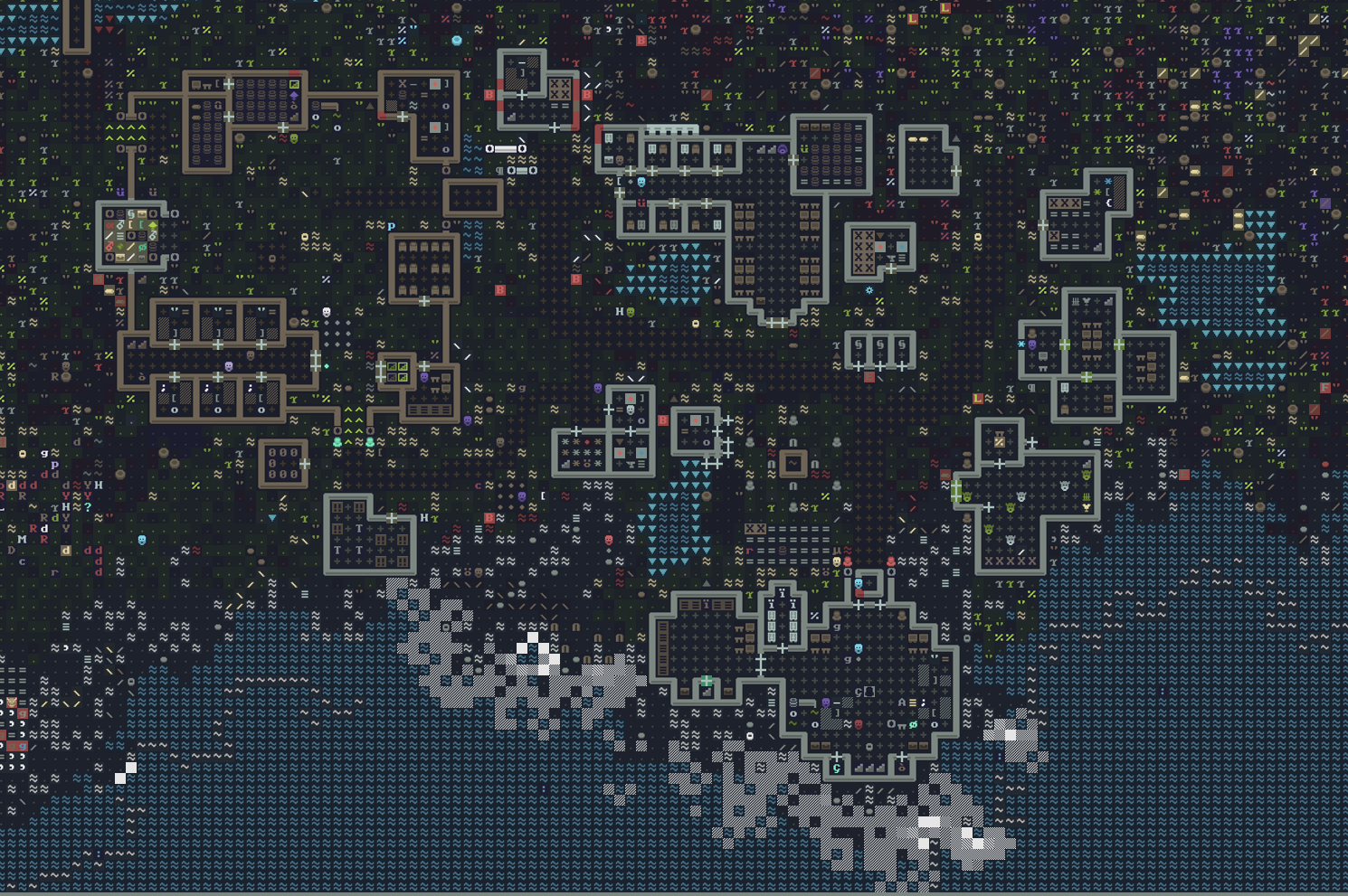
This is a very pretty tileset I found, love the colors here! Actual OG Dwarf Fortress looks more like this:
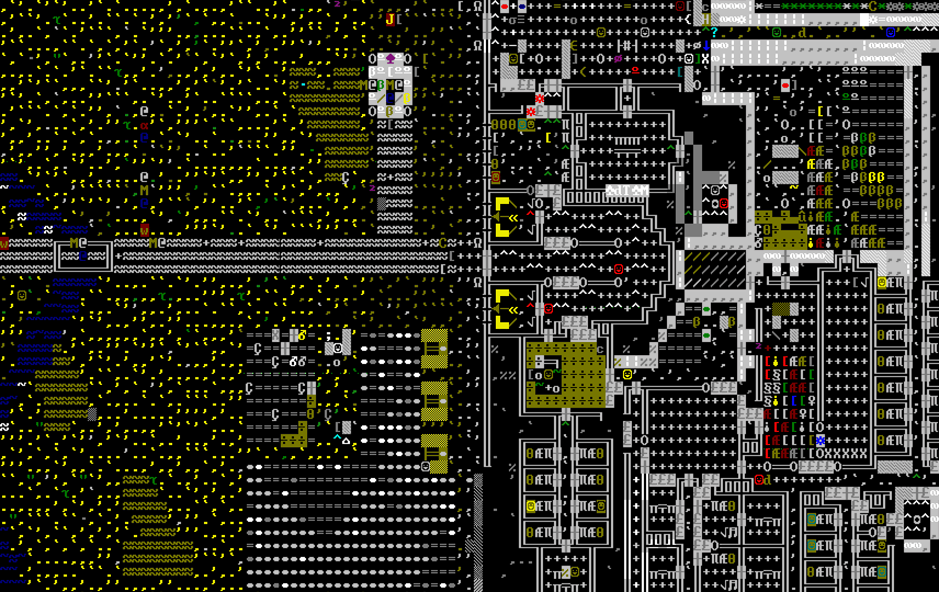
This style, of course, has it’s roots in classic Rougelikes such as Rogue. These ASCII tiles are coming from something called CP437, or Code Page 437, which was the character set of the original IBM PC (at least according to Wikipedia. I wouldn’t know personally, I wasn’t around back then). Some people love this, most people probably find it incomprehensible, confusing, or ugly. I think learning to read this is little like learning to read a language. It takes time and practice. Disclaimer, I’ve never actually played Dwarf Fortress with the ASCII (the Steam version has nice graphics now). I would probably get a headache after a little while.
A few observations though, just on these images:
- This style is incredibly information dense, which is actually amazing, especially for a complex game like Dwarf Fortress
- Being able to make different representations of objects in the game, just from a character and a color, is very powerful. From a development standpoint, it sounds like a great way to iterate on an idea, because you don’t really have to spend any time making or tweaking sprites.
- These two images alone support my first thesis statement: ASCII tiles can look, well, pretty ugly. However, if the color and character choices are done well, they can also look really nice, such as in the first image.
So, I knew I wanted to explore this style, particularly within the context of a large, open world, procedurally generated game with complex terrain such as mountains. This means that the world is going to have three dimensions, even though our tile grid is just 2D. Once again, Dwarf Fortress is the obvious example here, so I’ll probably keep referencing it. Another game I’ll reference is actually just Minecraft, as long as you think about it in the top-down perspective. The problem I’m trying to tackle here is: how can you convey a complex 3D world well with a 2D ASCII tile grid?
Depth
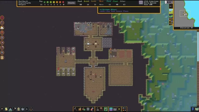
Let’s talk about depth. This seemed like the most obvious challenge to me, from the start. The first reference point I had was, once again, Dwarf Fortress. In Dwarf Fortress, the world is 3D, but you view it in layers (z-height). As you play, you move up and down the z-height to view different layers. If you’re on the surface, terrain that is higher than you is not visible, and terrain lower than you has a fog effect (at least in the graphical version). So you have these slope things that help to convey depth:
Tarn, the developer, mentions adding Z-levels later in development during this interview: “Adding the Z coordinate to make the game mechanically 3D (while still being text) was another {big refactor}, and really the most mind-numbing thing I’ve probably ever done. Just weeks and weeks and weeks of taking logic and function calls that relied on X and Y and seeing how a Z fits in there.”
This solution for depth is actually a great one, especially for the kind of game Dwarf Fortress is: one about dwarves. You end up spending much of the game underground, in your own man-made dwarven tunnels, which end up being fairly 2D naturally. It’s just easier to think in terms of 2D, flipping through Z-levels, then hold a 3D mental model of a world that you can’t completely see all the time (that’s not to say that you can’t spend the whole game above ground, because you certainly can).
I’ll call this depth approach “cross section mode”. The main problem I have with cross section mode, for the game I want to make, is that it doesn’t work quite so well on complex surfaces, beyond rolling hills. I’m interested in the player having the experience of traversing interesting terrain, and the idea of constantly flipping through Z-levels to get a feel for the structure of the land doesn’t sound very fun.
The next natural approach would be to use those slope tiles everywhere, and let the user see terrain higher then them. This adds a complexity that I don’t really like, because then units in the 3D world need to be considered “slope” units, and how do you convey a sheer wall?
Orthographic Projection
To solve this depth problem, I had the idea to draw each layer on top of the previous layer, shifted up a percentage, such that stacked tiles look, well, stacked on top of each other. This would be a form of orthographic projection reminiscent of The Legend of Zelda: A Link to the Past or Stardew Valley:
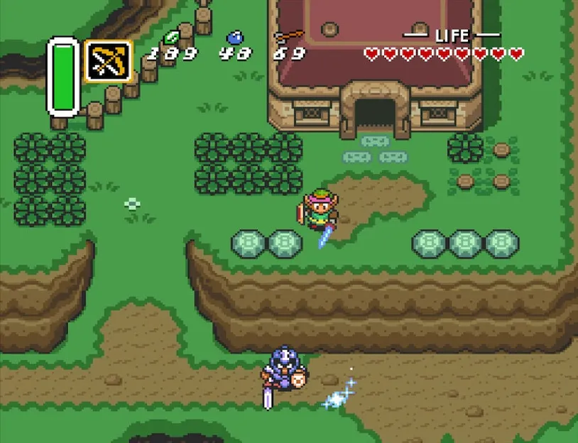
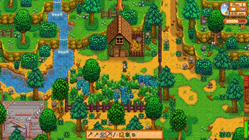
The thing is, this works so well in these games because they have well thought out, hand-crafted worlds. One of the issues is that the player can’t see themselves if they’re standing behind a tall object like a building. To solve this, these games mostly avoid having areas where the player might not be able to see their character, and so the world space ends up giving the feeling of increasing in elevation from bottom to top. Stardew Valley takes advantage of unseeable areas behind buildings by hiding special objects behind them, which is fun.
In a procedurally generated world, I imagine it would be hard to overcome this issue. For instance, if you are moving downwards, and there is a tall mountain below you, you’re suddenly going to disappear in a large, unseeable space. It just doesn’t work. I toyed around with the idea of allowing the player to rotate the perspective 90 degrees, which is the way I think Rollercoaster Tycoon solves this problem, but that adds another layer of complexity that I felt unsure about.
As a sidenote, unseeable spaces is one of the reasons I did not consider an isometric perspective (even though I LOVE isometric games), in addition to the added complexity of isometric coordinates. You can see the unseeable space problem cropping up with ISO-CORE (which looks absolutely stunning, by the way). The solution, like what this developer did, is to make sprites transparent when the player is behind them. But this doesn’t work as well for tall structures. Also, it’s impossible to gauge depth on edges that aren’t facing the players.
Overall, depth is pretty hard for orthographic perspectives because, well, it’s orthographic. Lack of depth is kind of the point.
3D ASCII
While looking around for inspiration, I stumbled upon this amazing demo. The author created depth with ASCII layers by essentially placing the vanishing point at the center of the screen and then scaling up higher layers:
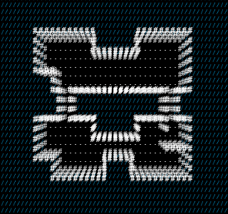
It’s really very simple, but I think it looks stunning. It reminds me of sci-fi holograms or point clouds. I dug around and found a couple other games that use this style: Door in the Woods and Light It.
It took me a couple evenings to recreate the effect in Monogame. The math is pretty simple, you just need to figure out where you want the vanishing point to be, and then scale each sprite you’re drawing away from it by a factor. Changing the color with greater depth also adds to the illusion.
Improvement
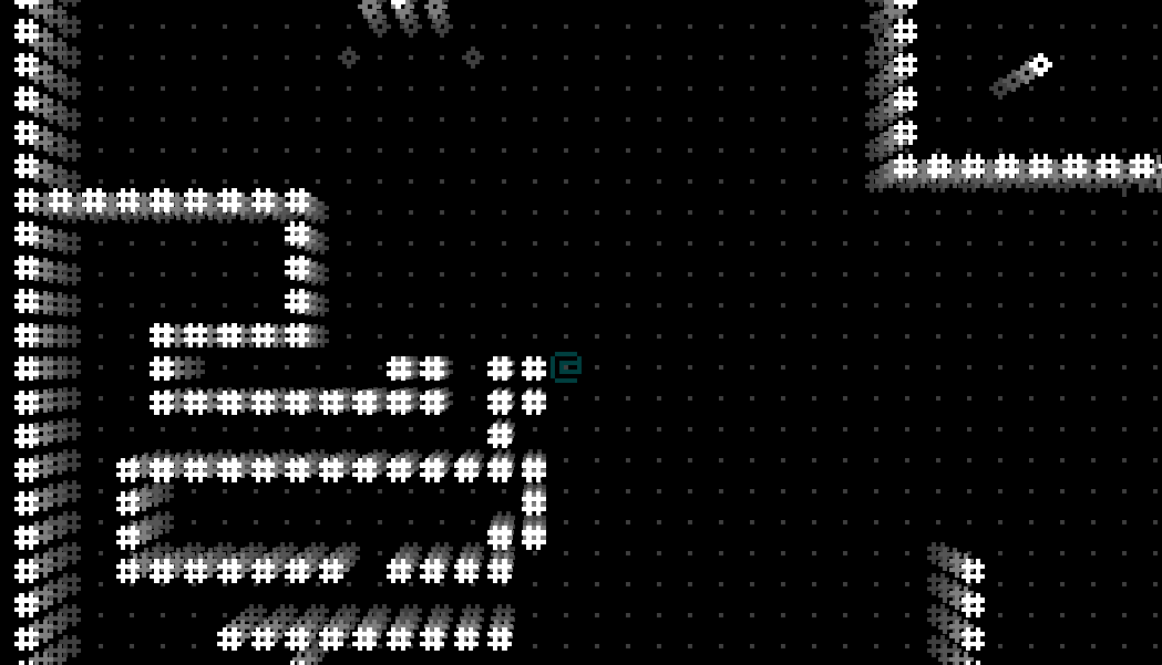
One of the first things I wanted to fix was the lack of depth near the vanishing point. In the image above, you can see that the vanishing point is placed exactly in the center, where the player is. So, anything next to the player collapses into 2D. What if I’m next to a wall, and I want to see what’s on the wall? To fix this, my initial thinking was to shift the vanishing point away, opposite the direction the player is “facing”. So, if they are facing a wall, it will stretch out so that they can see it.
I first implemented this by grabbing the direction of movement of the player, and then shifting the vanishing point back from that by a degree, giving the following result:
Ehh…it’s okay. A little dizzying, especially because, when you’re moving down, it begins to feel like you’re hanging upside down. It just doesn’t feel quite right. Slowing down the interpolation helps, but then it can begin to feel sluggish. It does succeed, however, at letting you look at walls close up.
I toyed with the idea of having a “smart” camera that moves the vanishing point based on whether you’re close to a wall or not. I began to realize that this would be very challenging to get right. The games with the best automatic cameras, like Super Mario Galaxy, are meticulously crafted for very detailed world spaces, and even those cameras can be a little annoying sometimes. So, I pivoted: why not just let the player control the camera?
The mouse pointer is a natural tool for this, so I calculated the vanishing point coordinate to be directly opposite of where the mouse pointer is, with the origin at the center of the screen.
This is closer to what I was envisioning, and it feels better to have control over the view. In the future, I’ll likely refine this more by limiting the effect (you can see how far it stretches in the beginning and end when I start and stop screen recording). I’ll probably also experiment with fixing the vanishing point, and only letting the player change it when they hold shift and move the mouse. Or, adding keyboard controls for moving this with IJKL. The effect can’t be changing all the time, only when the player needs to look at something from a different angle. Overall, I’m very pleased with how this solves the previously mentioned problems. In future posts, I’ll explore developing this style further with colors and custom sprites.